SwiftUI Charts in iOS 16
In this blog post, I will be walking you through SwiftUI Charts, a framework introduced at WWDC22 for creating charts in your applications.
Posted By Adam Bulmer In SwiftUI
Previously in iOS 15 you had to rely on 3rd party libraries to create charts. Currently, my workout app makes use of a library called Charts that I wrapped in a UIViewRepresentable.
With the introduction of SwiftUI 4 in iOS 16, Apple has now provided us with a framework to create charts within our apps. This new framework is declarative and enables you to render and animate charts using an API that will feel familiar.
The Anatomy of a Chart.
Every Swift chart can be broken down and customised to your requirements. Charts are made up of Axes, Legends, and Plot areas.
- Axes and Legends are used to help users interpret your chart.
- The Plot area is the main body of your chart where data is visualised using
Marks.
Charts require at least the Chart view and Marks to render successfully. Marks are the views that differentiate between different types of charts like Line Graphs and Bar charts.
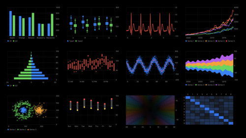
Apple provided Marks for several different chart types;
Basic Chart
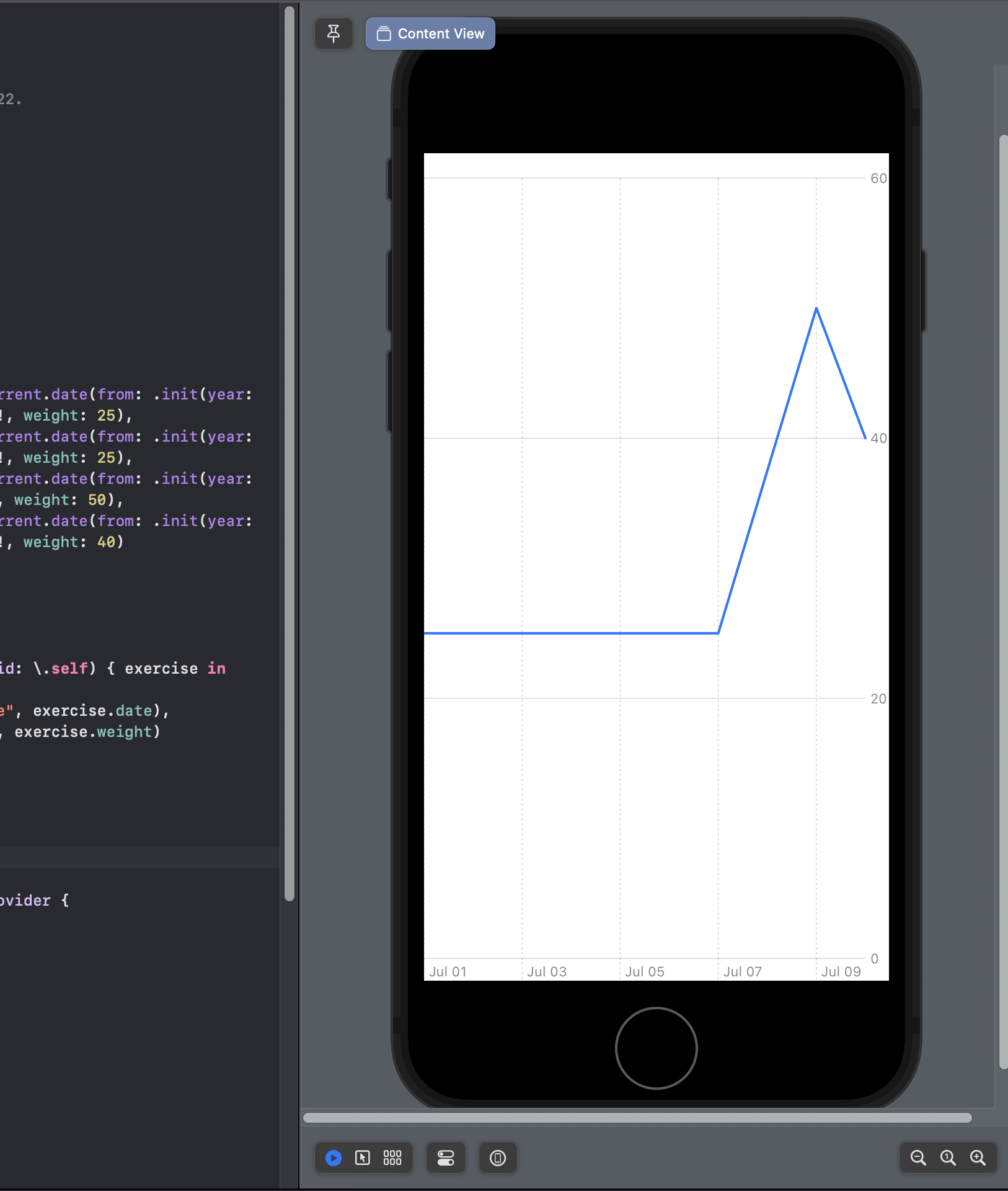
Throughout the rest of this blog post, I will be rendering charts with LineMarks to represent workout data as a line graph.
import Charts
import SwiftUI

struct ExerciseData: Hashable {
   let id = UUID()
   let date: Date
   let weight: Double
}

struct ContentView: View {
    let exerciseData = [
        ExerciseData(date: Calendar.current.date(from: .init(year: 2022, month: 07, day: 01))!, weight: 25),
        ExerciseData(date: Calendar.current.date(from: .init(year: 2022, month: 07, day: 07))!, weight: 25),
        ExerciseData(date: Calendar.current.date(from: .init(year: 2022, month: 07, day: 9))!, weight: 50),
        ExerciseData(date: Calendar.current.date(from: .init(year: 2022, month: 07, day: 10))!, weight: 40)
    ]

    var body: some View {
        VStack {
            Chart {
                ForEach(exerciseData, id: \.self) { exercise in
                    LineMark(
                        x: .value("Date", exercise.date),
                        y: .value("Kg", exercise.weight)
                    )
                }
            }
        }
    }
}
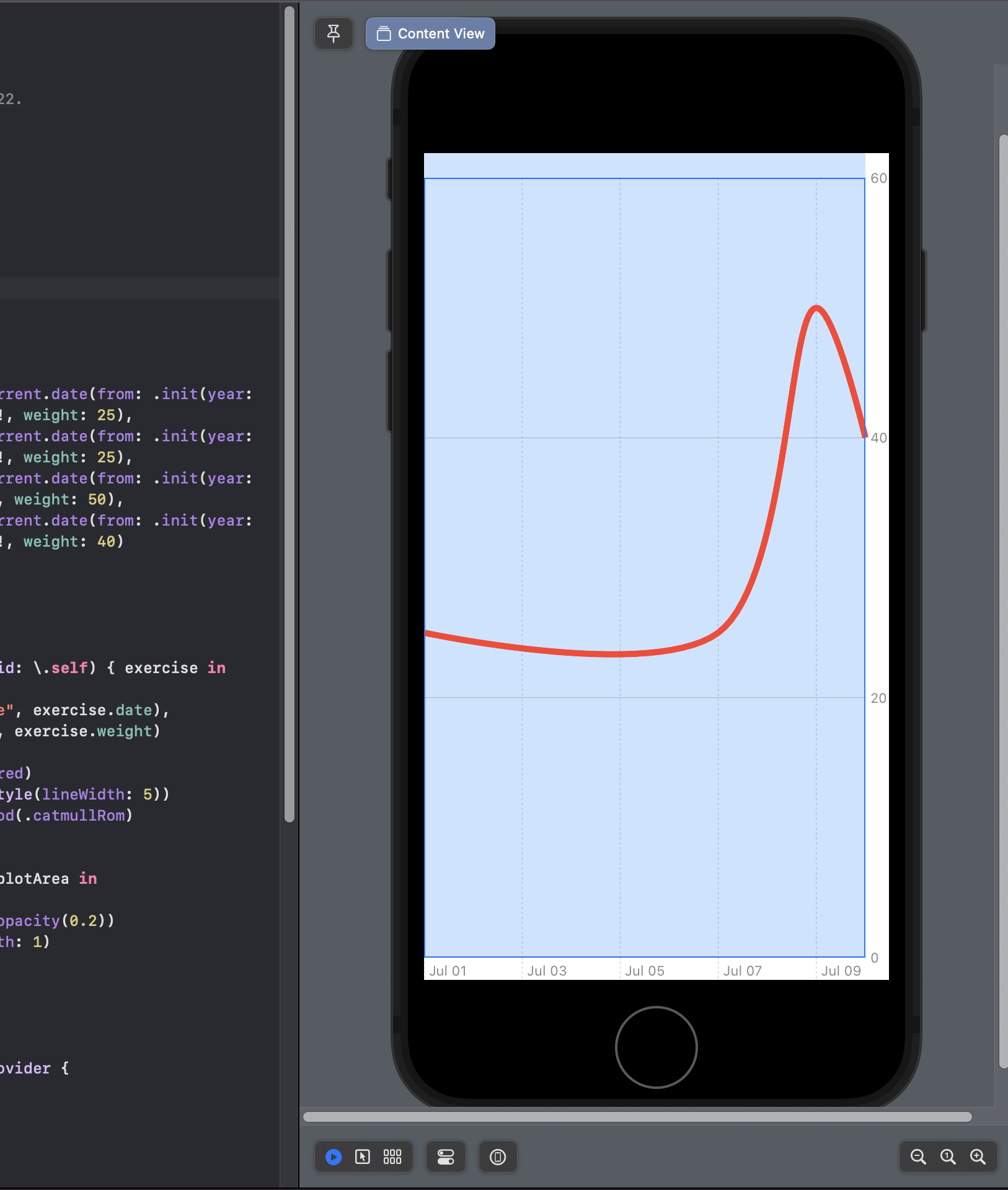
Change the Look of Your Chart
Apple has provided us with the ability to change different parts of our charts by applying SwiftUI view modifiers.
Let's build on the previous example and update the chart to change the appearance of our LineMarks and Plot area.
import Charts
import SwiftUI

struct ExerciseData: Hashable {
   let id = UUID()
   let date: Date
   let weight: Double
}

struct ContentView: View {
    let exerciseData = [
        ExerciseData(date: Calendar.current.date(from: .init(year: 2022, month: 07, day: 01))!, weight: 25),
        ExerciseData(date: Calendar.current.date(from: .init(year: 2022, month: 07, day: 07))!, weight: 25),
        ExerciseData(date: Calendar.current.date(from: .init(year: 2022, month: 07, day: 9))!, weight: 50),
        ExerciseData(date: Calendar.current.date(from: .init(year: 2022, month: 07, day: 10))!, weight: 40)
    ]

    var body: some View {
        VStack {
            Chart {
                ForEach(exerciseData, id: \.self) { exercise in
                    LineMark(
                        x: .value("Date", exercise.date),
                        y: .value("Kg", exercise.weight)
                    )
                    .foregroundStyle(.red)
                    .lineStyle(StrokeStyle(lineWidth: 5))
                    .interpolationMethod(.catmullRom)
                }
            }
                    .chartPlotStyle { plotArea in
                            plotArea
                    .background(.blue.opacity(0.2))
                    .border(.blue, width: 1)
            }
        }
    }
}
Here I am changing;
- The line colour to red using the
foregroundStyleview modifier. - The thickness of my line width by using the
lineStyleview modifier withStrokeStyle. - The line curve smoothness using the
interpolationMethodchart view modifier. - The background and border of the plot area to blue using the
chartPlotStylechart view modifier.
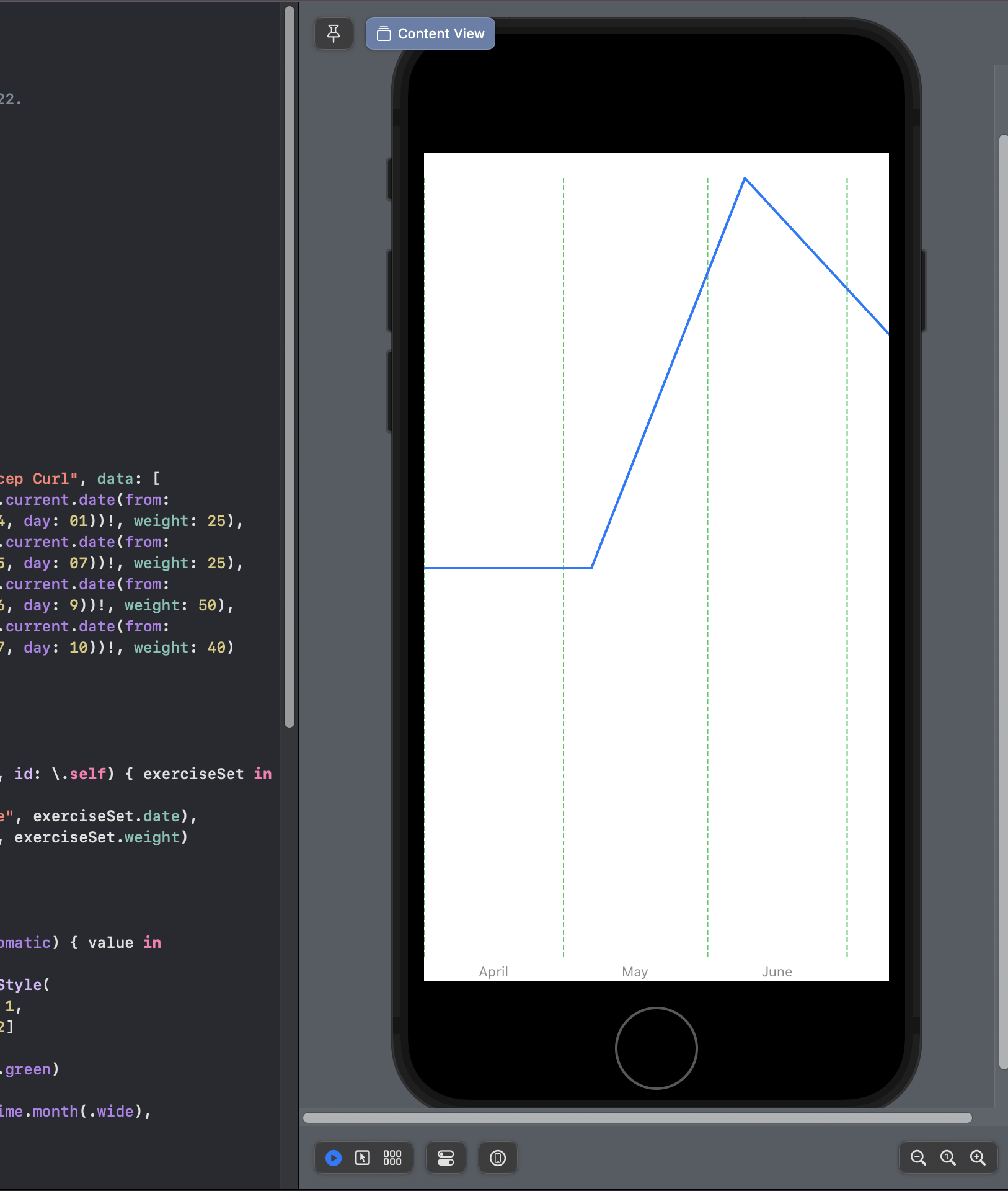
Customising the Chart Axes
The X and Y axes of a chart can be modified using the chartXAxis and chartYAxis modifiers.
import Charts
import SwiftUI

struct ExerciseSetData: Hashable {
   let id = UUID()
   let date: Date
   let weight: Double
}

struct Exercise: Hashable {
    let name: String
    let data: [ExerciseSetData]
}

struct ContentView: View {
    let chartData = Exercise(name: "Bicep Curl", data: [
        ExerciseSetData(date: Calendar.current.date(from: .init(year: 2022, month: 04, day: 01))!, weight: 25),
        ExerciseSetData(date: Calendar.current.date(from: .init(year: 2022, month: 05, day: 07))!, weight: 25),
        ExerciseSetData(date: Calendar.current.date(from: .init(year: 2022, month: 06, day: 9))!, weight: 50),
        ExerciseSetData(date: Calendar.current.date(from: .init(year: 2022, month: 07, day: 10))!, weight: 40)
    ])

    var body: some View {
        VStack {
            Chart {
                ForEach(chartData.data, id: \.self) { exerciseSet in
                    LineMark(
                        x: .value("Date", exerciseSet.date),
                        y: .value("Kg", exerciseSet.weight)
                    )
                }
            }
            .chartXAxis {
                AxisMarks(values: .automatic) { value in
                    AxisGridLine(
                        stroke: StrokeStyle(
                            lineWidth: 1,
                            dash: [4, 2]
                        )
                    ).foregroundStyle(.green)
                    AxisValueLabel(
                        format: .dateTime.month(.wide),
                        centered: true
                    )
                }
            }
            .chartYAxis(.hidden)
        }
    }
}
Here I am changing;
- The X-axis line colour to green and dashed.
- The text alignment of the X-axis label to be centred.
- The format of the X-axis label so it renders only the month name.
- The visibility of the Y-axis to be hidden.
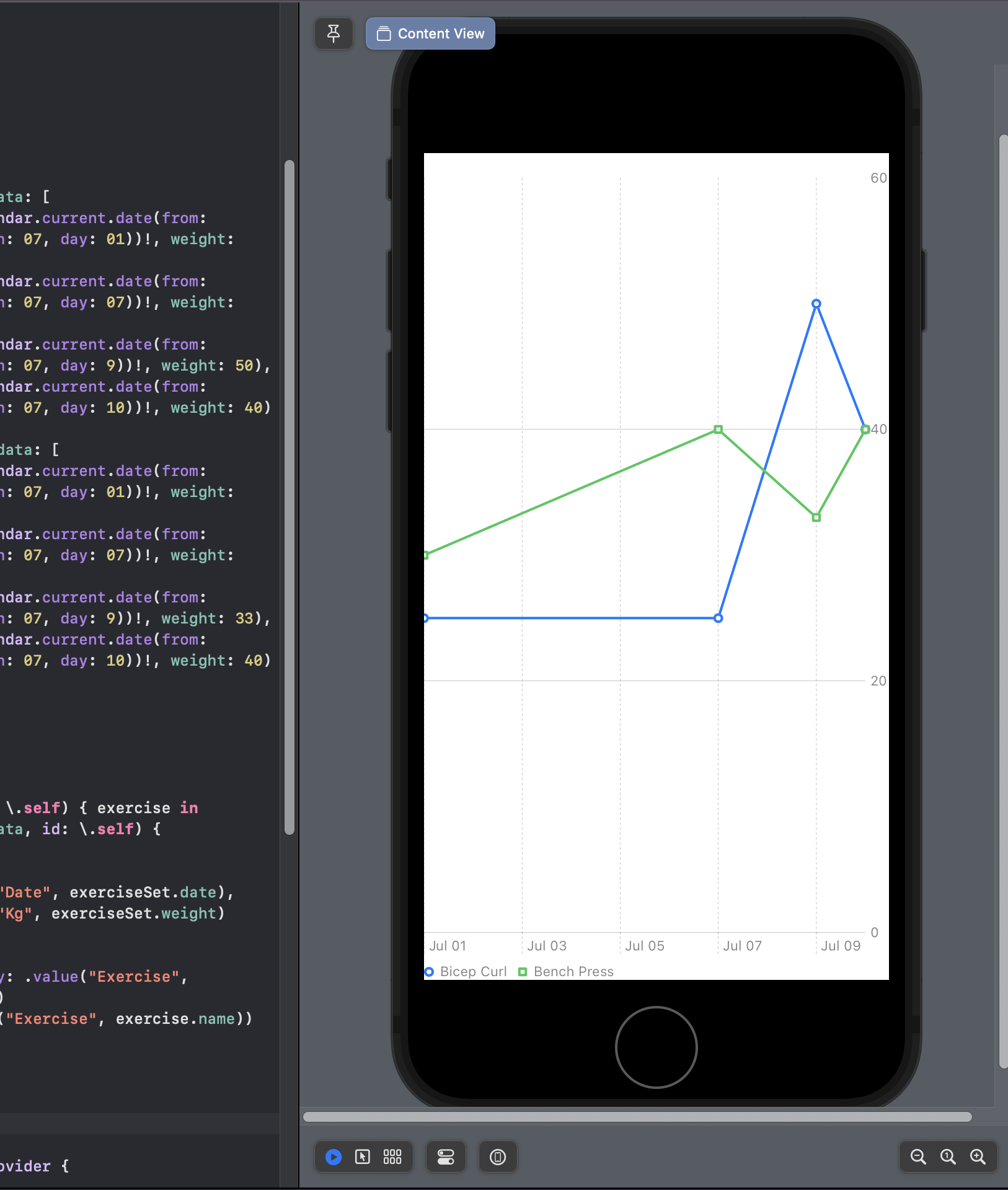
Plotting Multiple Data Series
SwiftUI Charts allow you to depict two or more variables that change over the same period of time. By defining an array of data series that have their own set of data points you can create a multi-line graph.
By default, SwiftUI Charts render the lines on the graph in the same colour. To help differentiate the data series on your graphs you can apply different styling to the Marks with foregroundStyle(by:) and symbol(by:) modifiers.
import Charts
import SwiftUI

struct ExerciseSetData: Hashable {
   let id = UUID()
   let date: Date
   let weight: Double
}

struct Exercise: Hashable {
    let name: String
    let data: [ExerciseSetData]
}

struct ContentView: View {
    let chartData = [
        Exercise(name: "Bicep Curl", data: [
            ExerciseSetData(date: Calendar.current.date(from: .init(year: 2022, month: 07, day: 01))!, weight: 25),
            ExerciseSetData(date: Calendar.current.date(from: .init(year: 2022, month: 07, day: 07))!, weight: 25),
            ExerciseSetData(date: Calendar.current.date(from: .init(year: 2022, month: 07, day: 9))!, weight: 50),
            ExerciseSetData(date: Calendar.current.date(from: .init(year: 2022, month: 07, day: 10))!, weight: 40)
        ]),
        Exercise(name: "Bench Press", data: [
            ExerciseSetData(date: Calendar.current.date(from: .init(year: 2022, month: 07, day: 01))!, weight: 30),
            ExerciseSetData(date: Calendar.current.date(from: .init(year: 2022, month: 07, day: 07))!, weight: 40),
            ExerciseSetData(date: Calendar.current.date(from: .init(year: 2022, month: 07, day: 9))!, weight: 33),
            ExerciseSetData(date: Calendar.current.date(from: .init(year: 2022, month: 07, day: 10))!, weight: 40)
        ])
    ]

    var body: some View {
        VStack {
            Chart {
                ForEach(chartData, id: \.self) { exercise in
                    ForEach(exercise.data, id: \.self) { exerciseSet in
                        LineMark(
                            x: .value("Date", exerciseSet.date),
                            y: .value("Kg", exerciseSet.weight)
                        )
                    }
                    .foregroundStyle(by: .value("Exercise", exercise.name))
                    .symbol(by: .value("Exercise", exercise.name))
                }
            }
        }
    }
}
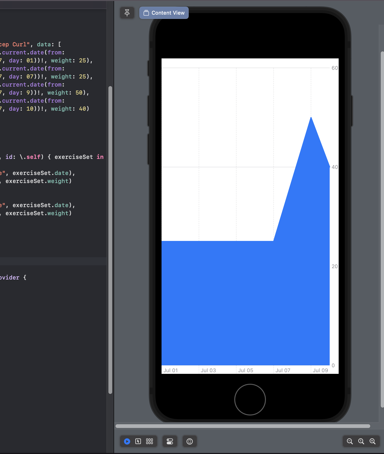
Combing Different Chart Types
I think it is important to show one feature of SwiftUI that demonstrates how flexible the Charts API is in SwiftUI. It is possible to overlay different Chart types in the same view.
import Charts
import SwiftUI

struct ExerciseSetData: Hashable {
   let id = UUID()
   let date: Date
   let weight: Double
}

struct Exercise: Hashable {
    let name: String
    let data: [ExerciseSetData]
}

struct ContentView: View {
    let chartData = Exercise(name: "Bicep Curl", data: [
        ExerciseSetData(date: Calendar.current.date(from: .init(year: 2022, month: 07, day: 01))!, weight: 25),
        ExerciseSetData(date: Calendar.current.date(from: .init(year: 2022, month: 07, day: 07))!, weight: 25),
        ExerciseSetData(date: Calendar.current.date(from: .init(year: 2022, month: 07, day: 9))!, weight: 50),
        ExerciseSetData(date: Calendar.current.date(from: .init(year: 2022, month: 07, day: 10))!, weight: 40)
    ])

    var body: some View {
        VStack {
            Chart {
                ForEach(chartData.data, id: \.self) { exerciseSet in
                    LineMark(
                        x: .value("Date", exerciseSet.date),
                        y: .value("Kg", exerciseSet.weight)
                    )
                    AreaMark(
                        x: .value("Date", exerciseSet.date),
                        y: .value("Kg", exerciseSet.weight)
                    )
                }
            }
        }
    }
}
Conclusion
Using SwiftUI Charts is a great way to visualise data for your users and I have only covered the basics of how to customise your charts. You can leverage many of the already existing SwiftUI view modifiers to further customise your charts.
If you want to see more examples of charts, Jordi Bruin and the iOS developer community have created an open source GitHub repo that covers a range of different chart types.
Some developers have gone the extra mile with the SwiftUI Charts framework, take for example this PingPong example created by Daniel Duan.
An Trinh has managed to create a vector field graph and replicated the GitHub contribution graph.
Subscribe To The Newsletter
If you want to create your first native app or have just begun your native app development journey, be sure to sign up to the newsletter. No Spam